
Poster
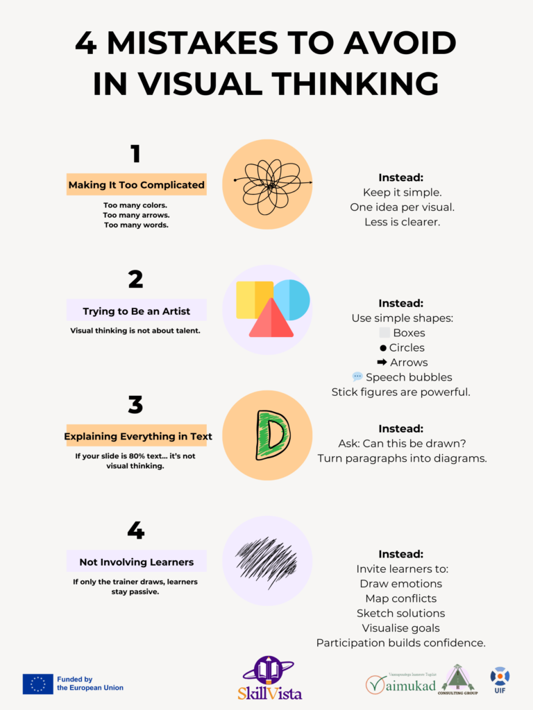

1️⃣ Making It Too Complicated
Te veel kleuren.
Te veel pijlen.
Te veel woorden.
Complexe visuals overweldigen in plaats van verduidelijken.
In plaats daarvan: Houd het simpel.
Gebruik basisvormen:
⬜ Boxes
Cirkels
➡ Arrows
💬 Speech bubbles
Stokjesfiguren zijn krachtig.
Eén idee per visual.
Minder is duidelijker.
2️⃣ Trying to Be an Artist
Visueel denken gaat niet over talent.
Het gaat niet om het ontwerp.
Het gaat niet om esthetiek.
Het gaat om structuur.
Als de tekening leerlingen helpt om een proces te begrijpen, na te denken over gedrag of verbanden te zien - dan werkt het.
Eenvoudig verslaat mooi.
3️⃣ Explaining Everything in Text
Als je dia 80% tekst...
het is geen visueel denken.
Vraag in plaats daarvan:
Kan dit worden getekend?
Kan ik van deze paragraaf een diagram maken?
Deel uitleg op in stromen, kaarten of reeksen.
Visuele structuur vermindert de cognitieve overbelasting en ondersteunt het vasthouden.
4️⃣ Not Involving Learners
Als alleen de trainer trekt, blijven de leerlingen passief.
Visueel denken wordt krachtig als leerlingen deelnemen.
Nodig ze uit:
Emoties tekenen
Kaart conflicten
Oplossingen schetsen
Doelen visualiseren
Deelname schept vertrouwen.
Tekenen externaliseert het denken.
Het samen creëren van visuals vergroot het eigenaarschap.
Dit project is gefinancierd door het Erasmus+ programma van de Europese Unie.
De steun van de Europese Commissie voor de productie van deze publicatie vormt geen goedkeuring van de inhoud, die uitsluitend de standpunten van de auteurs weergeeft, en de Commissie kan niet verantwoordelijk worden gehouden voor het gebruik van de informatie die erin is vervat.
Meer berichten
Stuur ons een bericht
Ontvang updates en blijf op de hoogte - Schrijf u in voor onze nieuwsbrief

SkillVista
Gefinancierd door de Europese Unie. Opvattingen en meningen zijn echter uitsluitend die van de auteur(s) en komen niet noodzakelijkerwijs overeen met die van de Europese Unie of het Uitvoerend Agentschap voor onderwijs en cultuur (EACEA). Noch de Europese Unie, noch EACEA kan hiervoor verantwoordelijk worden gehouden.
- Facebookpagina
- mail: admin@skillvista.eu